MENU
CLOSE
Damini

  • Carta-di-Luce

    Carta di Luce

  • ✶

DEtails

Client

Carta-di-Luce

Carta di Luce

Year

2025

Services

Branding

Website

Art Direction

Copy

BRIEF

Carta-di-Luce is a stationery brand built around the idea of timeless correspondence, where every piece is designed to feel personal, enduring, and beautifully crafted.

Carta di Luce is a stationery brand built around the idea of timeless correspondence, where every piece is designed to feel personal, enduring, and beautifully crafted.

IDEATION

Six identity directions explored different interpretations of timelessness, from clocks and brushes to typography and colour palettes, each finding a distinct way to make the passage of time part of the brand.

Final LOGO

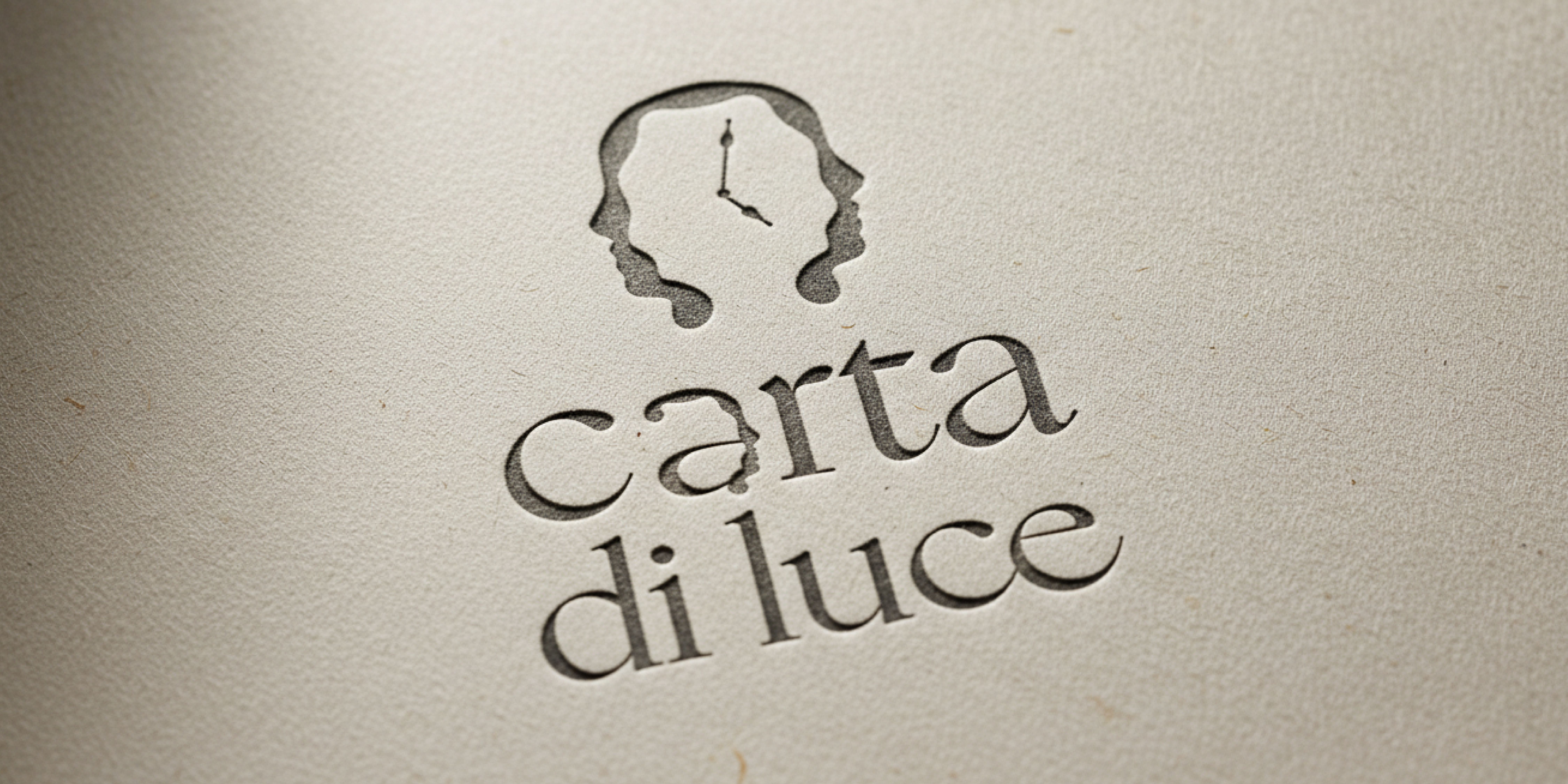
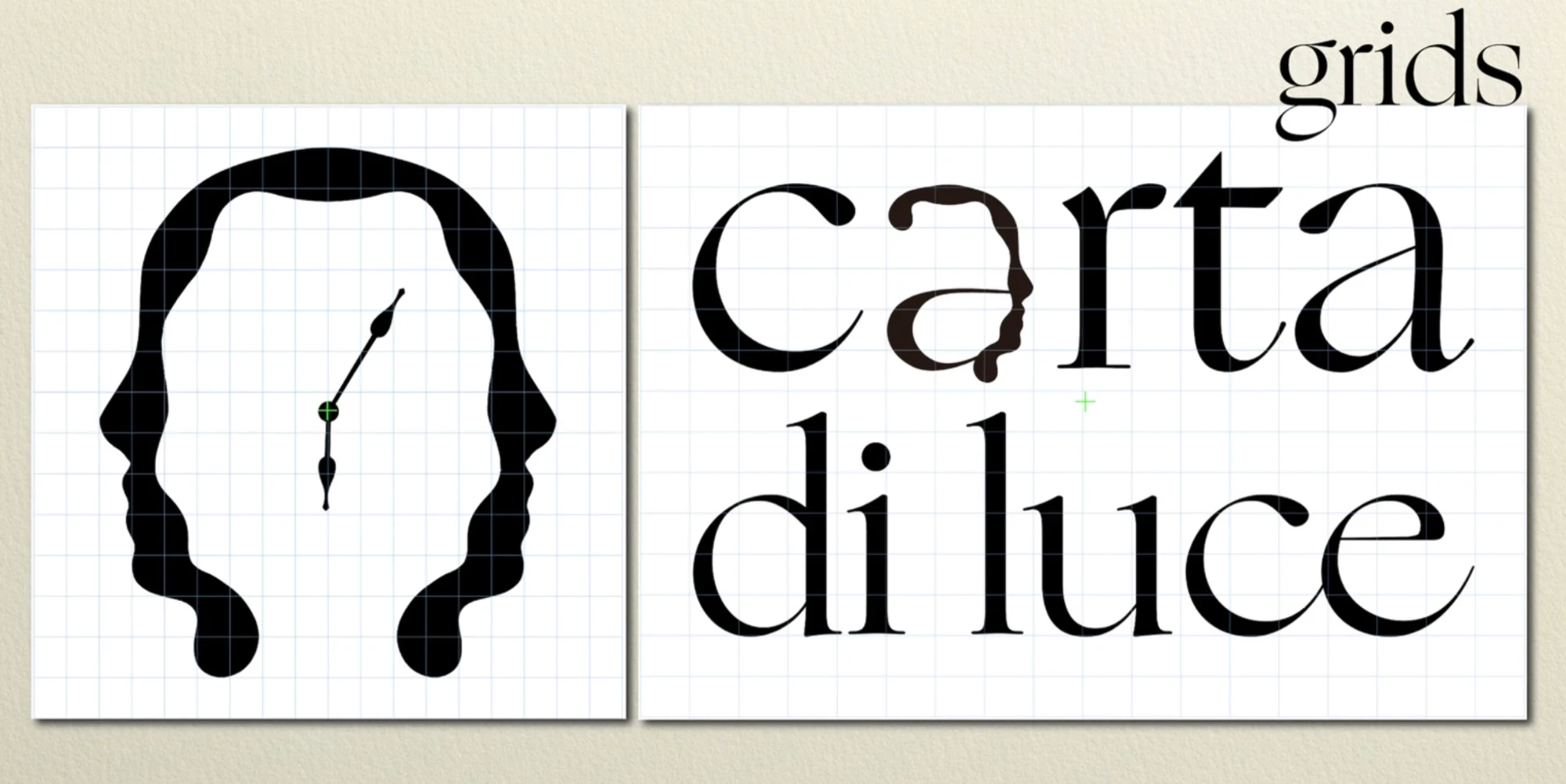
The final logo brings the idea together through an infinite face with a clock at its centre, creating a symbol that feels both personal and eternal. A visual expression of stationery designed to transcend time.
Touchpoints

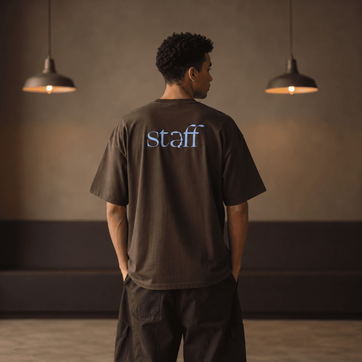
Extending the Carta-di-Luce identity across everyday touchpoints, from signage and enamel pins to envelopes, shopping bags, staff tees, and packaging tape.

Extending the Carta di Luce identity across everyday touchpoints, from signage and enamel pins to envelopes, shopping bags, staff tees, and packaging tape.